


As an investor, your primary concern lies in the efficient allocation of capital and the predictable realization of returns. When you fund a technology startup or a digital product venture, the development process can often appear opaque. You see the code being written, but you do not see the daily progress. This opacity creates risk. To mitigate this risk, you need visibility into how work is moving from concept to completion.
The Burn Down Chart is a fundamental tool in Agile project management designed to provide exactly this kind of visibility. It is not merely a graph for developers; it is a communication device for stakeholders. For a non-technical investor, understanding this chart allows you to assess project health without needing to understand the underlying code. It transforms abstract effort into tangible data regarding timeline, scope, and risk.
This guide will walk you through the mechanics, interpretation, and strategic value of Burn Down Charts. We will strip away the jargon and focus on what matters for your portfolio management.
What is a Burn Down Chart? 🤔
A Burn Down Chart is a visual representation of work remaining over time. It is used to track progress within a specific period, such as a Sprint in Scrum, or an entire product release. The chart answers a simple question: How much work is left, and how quickly are we finishing it?
In the context of your investment, this tool signals whether the team is on track to deliver value by the agreed-upon date. It is a dynamic report that updates regularly, often daily. Unlike a static Gantt chart that might become outdated the moment a task changes, the Burn Down Chart reflects the current reality of the team’s output.
Key characteristics include:
Visual Simplicity: It uses basic lines and bars to convey complex status information.
Time-Based: The horizontal axis represents time (days or weeks).
Work-Based: The vertical axis represents the amount of work remaining.
Real-Time: It is updated as soon as a task is completed.
The Anatomy of the Chart 🔍
To interpret the data correctly, you must understand the axes and the lines plotted on the graph. Misinterpreting these elements can lead to false conclusions about the team’s performance.
The Horizontal Axis (X-Axis)
This axis represents time. In an Agile context, this is usually broken down into iterations. For example, a team might work in two-week cycles called Sprints. The chart covers the duration of one cycle or the duration of the entire project.
Sprint Level: Shows progress for a two-week window.
Release Level: Shows progress for the entire product launch timeline.
For investors, the Release Level is often more relevant for long-term forecasting, while the Sprint Level helps assess short-term velocity and consistency.
The Vertical Axis (Y-Axis)
This axis represents the remaining work. This is typically measured in story points, hours, or the number of tasks. Story points are a common unit that estimates the relative effort required to complete a task rather than the exact time it takes.
Total Work: The starting value at the top left represents the total scope agreed upon at the beginning.
Remaining Work: The value decreases as the team completes items.
The Two Critical Lines
There are two lines that define the narrative of the chart:
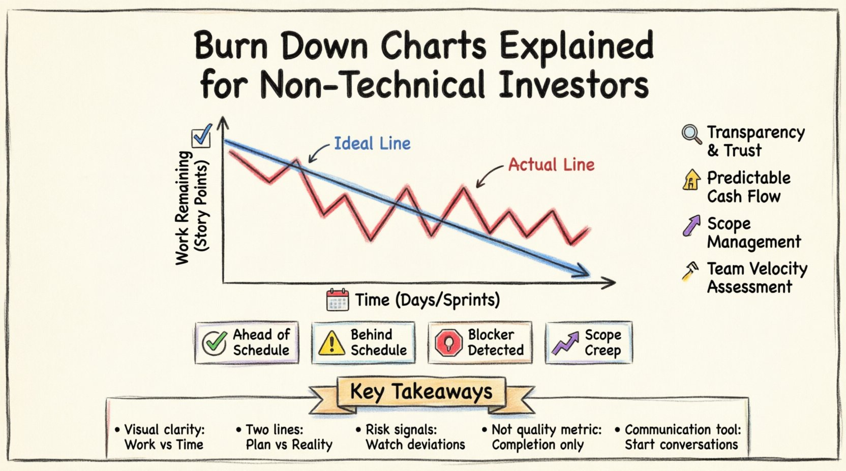
The Ideal Line (Blue): This is a straight diagonal line descending from the top left to the bottom right. It represents the perfect scenario where work is completed at a constant rate, finishing exactly on the deadline.
The Actual Line (Red): This is a jagged line that fluctuates based on daily progress. It shows the real amount of work remaining at the end of each day.
How to Read the Data 📊
The relationship between the Ideal Line and the Actual Line tells the story of the project’s health. You do not need to be an engineer to read this story.
Scenario 1: The Line is Below the Ideal
If the Actual Line falls below the Ideal Line, the team is ahead of schedule. They have completed more work than the average rate required to finish on time.
Implication: This is generally positive. It suggests high velocity or a conservative estimate of the initial scope.
Caution: Sometimes, being too far ahead can indicate that the team is under-utilizing capacity or that the scope was underestimated significantly.
Scenario 2: The Line is Above the Ideal
If the Actual Line is above the Ideal Line, the team is behind schedule. They have not completed enough work to stay on track for the deadline.
Implication: This signals risk. If the gap widens, the team will miss the delivery date unless scope is reduced or resources are added.
Investor Action: Investigate the cause. Is it technical debt? Unforeseen complexity? Or a lack of focus?
Scenario 3: The Line is Flat
If the Actual Line remains horizontal for several days, no work is being completed. This is known as a blocker.
Implication: Something is stopping progress. This could be a technical dependency, a missing resource, or a decision that needs to be made.
Investor Action: This requires immediate attention. A flat line is a warning sign of stagnation.
Scenario 4: The Line Goes Up
Occasionally, you might see the Actual Line move upward. This means the team has added more work to the plan.
Implication: This is often referred to as scope creep. New requirements were discovered, or the client requested additional features.
Investor Action: Verify if this was a deliberate change. If the budget was fixed, adding scope without extending the timeline will increase the risk of failure.
Why This Matters to Investors 💰
For a non-technical investor, the Burn Down Chart is a risk management tool. It provides early warning signals that traditional financial reports might miss. Here is how it translates to your investment thesis.
1. Transparency and Trust 🤝
Agile methodologies rely on radical transparency. The Burn Down Chart removes the ability to hide progress issues. A team cannot claim everything is fine if the chart shows they are significantly behind. This transparency builds trust between the founders and the capital providers.
2. Predictability of Cash Flow 💸
Investments often come in tranches based on milestones. If the Burn Down Chart shows consistent delays, you know that the next milestone might be late. This allows you to adjust your cash flow expectations or negotiate terms related to delivery schedules.
3. Scope Management 📏
One of the biggest risks in software development is scope creep. Features are added that were not originally planned. The Burn Down Chart makes this visible. If the total work number (Y-axis start point) increases mid-project, you know the scope has expanded. This helps you understand why a project might take longer than the original pitch.
4. Team Velocity Assessment 🚀
Over time, you can calculate the team’s Velocity. Velocity is the average amount of work completed per iteration. By looking at the slope of the Actual Line over several sprints, you can determine if the team is reliable.
Consistent Velocity: The team hits their targets regularly. High confidence.
Erratic Velocity: The team hits targets one week and misses the next. High risk.
Common Misconceptions ❌
While powerful, the Burn Down Chart is not a magic wand. There are common misunderstandings that can lead to poor decision-making.
Misconception 1: It Measures Quality
A Burn Down Chart only measures the quantity of work completed. It does not indicate whether the code is bug-free, the user experience is intuitive, or the security standards are met. A team can burn down all their tasks quickly but deliver a broken product. You must pair this chart with quality metrics.
Misconception 2: It Predicts the Future Perfectly
The chart is a snapshot of the past and present. Extrapolating the current line to predict the final date is an estimation, not a guarantee. The Actual Line can change direction at any time due to new discoveries or team changes.
Misconception 3: More Points Mean More Work
Story points are relative, not absolute. One team might assign 5 points to a task that another team assigns 10 points to. Comparing the burn down of Team A against Team B is invalid. You must compare the chart of a single team over time.
Burn Down vs. Other Methods 📋
Investors may encounter other visualization tools. It is useful to understand where the Burn Down Chart fits in the broader landscape.
Method | Primary Focus | Best Used For |
|---|---|---|
Burn Down Chart | Work remaining over time | Tracking progress within a fixed timeframe |
Burn Up Chart | Work completed vs. Total Scope | Tracking scope changes (increases or decreases) |
Kanban Board | Work in progress (WIP) | Managing flow and bottlenecks in real-time |
Gantt Chart | Dependencies and dates | Long-term planning and resource allocation |
The Burn Down Chart is particularly strong for Agile teams because it focuses on the iterative nature of delivery. However, if your investment involves significant scope changes, a Burn Up Chart might be more accurate because it visualizes when new work is added to the total scope.
Questions to Ask Your Portfolio Companies 🗣️
When reviewing the Burn Down Chart with the founding team, asking the right questions demonstrates engagement and helps uncover deeper insights. Avoid asking about technical details; focus on the implications of the data.
Why did the line spike up last week?
This forces the team to explain scope changes. Is it a bug fix or a new feature request?Is the Ideal Line still realistic?
If the Actual Line has been far above the Ideal Line for weeks, the original deadline might be impossible. Has the team adjusted the plan?Are we burning down consistently?
Look for patterns. Is progress steady, or are there long periods of inactivity followed by a rush?What is the trend line?
If you connect the dots of the Actual Line, is the slope getting steeper (improving) or flatter (slowing down)?
The Psychological Impact 🧠
It is important to recognize the human element in this chart. For developers, the Burn Down Chart is a motivation tool. Seeing the line go down gives a sense of accomplishment. However, for investors, it can sometimes induce pressure.
If the chart shows a delay, the immediate reaction might be to demand more hours or more staff. In Agile, adding people to a late project (Brooks’s Law) often makes it later. The Burn Down Chart helps you understand that the issue is likely process or scope, not just effort.
Focus on the Trend: Don’t panic over a single day’s data. Look at the week-over-week trend.
Trust the Process: Agile teams are expected to adapt. If the chart shows a dip, a good team will adjust the next iteration to compensate.
Collaborative Review: Treat the chart as a shared problem to solve, not a report card to judge.
Long-Term Investment Strategy 📈
When building a portfolio of technology companies, consistency is key. A single Burn Down Chart tells a story about one sprint. A series of charts tells a story about the company’s maturity.
Early Stage: You expect volatility. The chart will likely be jagged as the team learns how to estimate work. The focus here is on the trend improving over time.
Growth Stage: The chart should stabilize. Velocity should be predictable. Delays should be rare and explained by clear strategic shifts.
Scaling Stage: As the company grows, the chart might become less relevant for the whole company and more relevant for specific product teams. You need to ensure the metrics are being aggregated correctly.
Summary of Key Takeaways 📝
Understanding Burn Down Charts empowers you to be a more informed investor. It moves the conversation from “When will it be done?” to “What is the current trajectory?”.
Remember these core principles:
Visual Clarity: The chart shows remaining work against time.
Two Lines: Compare Ideal (plan) vs. Actual (reality).
Risk Indicator: Deviations signal potential delays or scope changes.
Not a Quality Metric: It measures completion, not correctness.
Communication Tool: Use it to facilitate honest conversations with the team.
By integrating this knowledge into your due diligence and post-investment monitoring, you gain a sharper lens on the operational health of your tech investments. You do not need to write code to understand the value of this tool; you only need to understand the value of time and scope.
As you review your portfolio, request access to these charts. It shows you are engaged and helps the management team maintain the discipline required to deliver on their promises. In the world of software investment, visibility is the foundation of trust.